Is Electricity Production linked to Economic Performance in South Africa?
- Shail Mirpuri
- Sep 28, 2020
- 6 min read

Over the past weekend, I was able to take part in the UC X Imagine Scholar Datathon, and win the best novice project. This event allowed me to pursue my passion for data alongside other students from all the UC campuses, and do so for a great cause. Imagine Scholar, a nonprofit organization that runs an after-school mentorship program in rural South Africa, works with low-income students to provide academic enrichment and support. Over the weekend, we were all challenged to analyze and visualize data about energy and load shedding in South Africa in a insightful and creative way. I decided to apply unsupervised machine learning and explore whether South Africa’s economic growth and environmental sustainability is in fact linked to its electricity production. My work was chosen as the best novice project for this event. More importantly, I was able to gain invaluable experience into cleaning and preprocessing real-world datasets to derive impactful insights! Below is a summary of my project:
Introduction
It is a common belief that the growth and development of a country is heavily reliant on its ability to distribute sufficient electricity to its citizens. In South Africa, however, the production of electricity has struggled to adapt to the rising demand for it that has resulted from technological advancements and population growth. Uncovering the importance of electricity to the entire South African economy can be vital in informing budget allocation and infrastructure development decisions taken by their government. As a result of this, I decided to explore whether South Africa’s economic growth and environmental sustainability is in fact linked to its electricity production by analysing two datasets consisting of economic and electricity data spanning from 1985 to 2018.
Procedure
First, we will consider the electricity dataset with specific focus on the evolution of electricity production over time.

From the figure above, we can see that for the most part there has been growth in the total electricity produced as time has gone along. More specifically, we can see that up till around 2006/2007 there was a strong positive correlation between time and the total energy produced. This means that up till this point in time there had been year on year growth in the amount of energy produced. However, more recently it seems that electricity production has plateaued. This may indicate that the current energy production infrastructure is being maximized to its full capabilities, which means that it can’t produce over 22,000 Gigawatts Hours of electricity and meet the demand of the rising South African population. We will now investigate this plateau further by computing and visualizing the yearly average electricity production growth over this period.

From the figure above, we can see that in comparison to the rest of South Africa’s history, the last 10 years have been relatively bleak in terms of energy production growth with some of these years having a decline in electricity production. This is extremely alarming considering the growing needs of electricity to sustain South Africa’s economy. We will now investigate how each year’s economic performance in South Africa is linked to the corresponding growth in electricity production for that given year by applying a form of unsupervised machine learning: KMeans Clustering.
The idea behind this is that we will group each year’s economic performance into 3 different groups using our clustering algorithm. These groups will be decided by applying our algorithm to 6 key metrics for each year that are indicative of quality of life, economic development and environmental sustainability within South Africa. These metrics will be taken from our economic dataset from the World Bank and include: GDP, CO2 emissions, Foreign Direct Investment, GNI per capita, Life Expectancy and Gross School Enrolment. In order to compare year on year economic performance we will look at these metrics in terms of their growth from the previous year. Furthermore, to ensure that our algorithm considers each metric with the same relative importance when clustering, we will normalize each of them and scale them between 0 and 1 using the MinMaxScaler function in Python’s Scikit Learn library.
Finally, we will also take the reciprocal of CO2 emissions growth as our measure since machine learning models tend to interpret higher numerical variables as better. However, in the case of this metric the greater the CO2 emissions the worse it is for South Africa’s environmental sustainability. Furthermore, analysing our cluster will be significantly easier if we know that for all our performance metrics the higher the metric, the better the yearly performance. With all these considerations in mind, I decided to take the reciprocal of CO2 emissions growth and then rescale the data for this metric back between 0 and 1. We are now ready to apply our model to the pre-processed data. After this, we will analyse the features of each cluster and interpret what each cluster represents.
Summary/Interpretation of Each Cluster
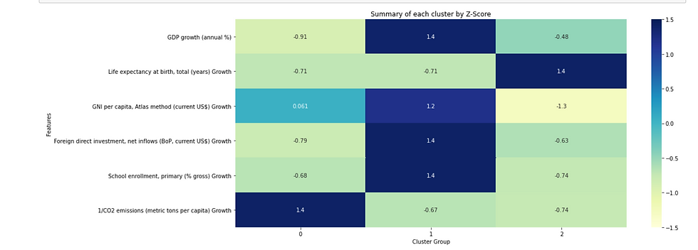
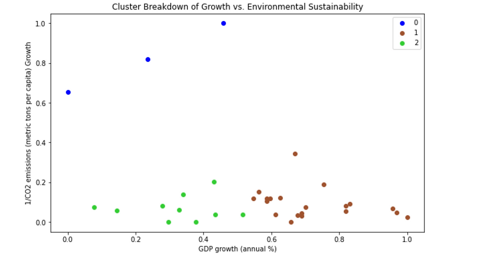
Group 0: Environmentally Friendly Years
Group 0 can be classified as the group made up of the environmentally friendly years in South Africa. This can clearly be seen in the heatmap and scatter plot, in which group 0 has a significantly higher reciprocal of CO2 emissions growth than the other two clusters. Essentially what this means is that during each of the years in this group, there was a significant yearly reduction of CO2 emissions. Therefore, we shall interpret this cluster as the environmentally friendly years.
Group 1: Strong Economic Growth
Group 1 seems to consist of the years which South Africa’s economy grew the most. This is reflected through the heatmap and scatterplot, which both show this cluster’s superior GDP growth, Foreign Direct Investment, and School Enrolment growth amongst other factors. It is also interesting to observe that for all the years which the South African economy grew rapidly, there is also growth in CO2 emission rates. This suggests that these two metrics may go hand-in-hand.
Group 2: Poor Performing Years
Finally, Group 2 can be labelled as the worst economic performing years. Firstly, this is because in these years there has tended to be a large growth in CO2 emissions. Additionally, this group has had significantly less GDP growth than group 1 and a similar GDP growth as group 0. All in all, the above evidence suggests that this cluster is made up of the worst performing years in South Africa.
We will now use our clusters to analyse the breakdown of yearly growth in electricity production. We will group the energy production yearly growth rate by cluster and aggregate this yearly growth rate by taking the mean. This will allow us to determine whether there is a link between economic performance and energy growth.
Breakdown of Energy Production Growth by Cluster
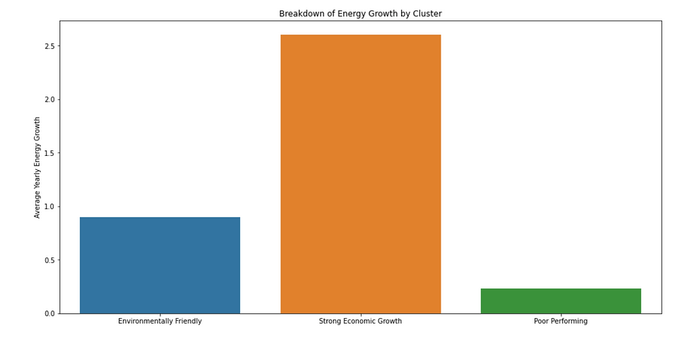
From the figure above, it can clearly be seen that in years, when there is strong economic growth there seems to be a significantly higher yearly average energy growth. This suggests that energy may be the engine which stimulates economic growth and development in South Africa. On the other hand, we can see that in poor performing years there tends to a lower annual average energy growth rate. Remember that we did not include the growth rate of electricity produced as a feature in our cluster model so this has not influenced the clustering of the years. Another interesting thing to note is that in environmentally friendly years there tends to be greater energy growth than in poor performing years. This may be somewhat contradictory to what we would expect since in environmentally friendly years there is less CO2 emissions than in poor performing years. This might indicate that energy growth can be environmentally sustainable due to other factors that may actually reduce CO2 emissions such as greater productivity and innovation.
Conclusion
Overall, we have analysed the link between economic factors and electricity in South Africa by developing a cluster model that has grouped the economic performance of each year into 3 clusters based on 6 key metrics. After this, we have explored the key features of each cluster and labelled each with what we think it represents. Following this, we have performed an analysis of energy growth rates using our clusters to find that yearly average energy growth in South Africa seems to play a huge role in the yearly economic performance of the country. As we have earlier established, over the last 10 years there has been relatively little growth in energy production within the country. With all this evidence, it is imperative that the South African government allocates more money into improving the energy infrastructure in order to meet the growing demand for energy. This can be pivotal in ensuring that the country is able to achieve both long and short term economic growth, better quality of life for its citizens and greater environmental sustainability.
All in all, this event was a great experience, in which I was able to learn a ton of new skills and gain a deeper dive into the data science field through the different workshops, talks and projects over the weekend. I am looking forward to taking part in more datathons in the future!
References


Comments